Overview
Subscribe to Our Newsletter
Get expert guidance on various topics, resources, and exclusive insights
Why Accessibility is Essential in UI/UX Design?
The term accessibility is frequently used in the design world. You might have heard this word quite a lot if you’re a UI/UX/Web Designer or in the design field. And you might wonder why it’s important.
It’s so human to take things for granted that we’re used to. It involves being good at listening, reading, speaking, and understanding, as well as being able to communicate and move freely.
However, take a moment and think about the people around us who experience the world differently. And they are in significant numbers.
Because WHO statistics estimate that 1.3 billion people have significant disabilities (and that’s every 1 in 6 of us). This is a thing that can’t be ignored. These can be temporary impairments or permanent disabilities, but none of them make life easier.
Understanding Accessibility?
There are many definitions of accessibility on the internet. Accessibility, in the context of digital and web design, boils down to one thing: ensuring that content is usable for people with disabilities.
Designing with accessibility in mind means creating websites, applications, and digital interfaces that can be easily navigated by individuals with various impairments, such as those affecting vision, hearing, motor skills, or cognitive abilities.
Debunking Common Myths
Just like every topic when it comes to accessibility, there are lots of opinions floating around, but not all of them are accurate. So, let’s debunk some common myths:
Myth 1: Alt Text Is All You Need for Accessibility
Alt text is important for assistive technologies, but there’s more to accessibility than that. True accessibility comes from designing interfaces and content with everyone in mind, not just adding alt text as an afterthought.
Myth 2: Accessibility Is Only for People with Disabilities
While accessibility is vital for people with disabilities, it benefits everyone. From older users to those with temporary limitations, accessible design makes websites and apps easier for everyone to navigate and use.
Myth 3: You Should Only Care About Accessibility to Avoid Legal Trouble
Sure, accessibility is a legal and ethical requirement as well, but that’s not the only reason to prioritize it. Building accessible websites and apps makes them easier for everyone to use, not just to meet legal standards.
Myth 4: People with Disabilities Won't Use Your Platform
Don’t assume that people with disabilities won’t visit your website or use your app. Disability can affect anyone, and designing with accessibility in mind ensures that everyone, regardless of ability, can access and use your platform effectively.
Why Accessibility Matters?
Accessibility holds significant importance for several reasons. Integrating accessibility into your designs serves to enrich the experience of all users, regardless of their abilities, thereby facilitating smoother interaction with your platform.
Having an accessible platform allows users of diverse backgrounds and circumstances to engage with your platform, thereby expanding your marketing reach and customer demographics.
Moreover, accessibility fosters inclusivity and combats discrimination based on disabilities, reinforcing the principle of equal access to opportunities, information, and social services for everyone.
Also, accessibility enhancements contribute to user satisfaction, usability, and overall engagement with products and services as they enhance the usability of websites and applications. Clear navigation, intuitive design, and similar features benefit all users, further emphasizing the importance of accessibility in design considerations.
How to Incorporate Accessibility in Your Designs?
Understand the Basic Guidelines
Start by familiarizing yourself with accessibility standards such as the Web Content Accessibility Guidelines (WCAG). These guidelines offer thorough recommendations for creating digital content that is accessible to all users.
Use Sufficient Color Contrast
Choose color combinations that are accessible to individuals with color blindness or low vision. Utilize tools to verify the color contrast ratio and guarantee that text stands out clearly against the background.
Here’s an illustration of achieving sufficient color contrast:
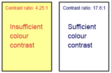
Ensure that the colors contrast effectively to highlight important elements. Similar to the image on the right, this approach is likely to be accessible for individuals with color blindness or low vision.
Implement Responsive Design
Some designers only focus on desktop versions, overlooking accessibility considerations. However, prioritizing responsive design proves far more advantageous.
Ensuring adaptability across different screen sizes and resolutions caters to users employing diverse devices, enhancing overall accessibility.
Here’s a demonstration of responsive design implementation:


Above is an example of our website’s homepage featuring both the mobile and desktop versions. The responsive design not only enhances accessibility but also demonstrates consideration for users utilizing various devices, as discussed earlier.
Provide Feedback and Error Handling
Ensuring that your designs offer ample feedback, along with clear guidance on the subsequent steps, is essential for delivering an exceptional user experience. Mishandled error notifications can easily discourage users. Thus, it’s imperative to prioritize adequate feedback to enhance the accessibility of your design.
These are just a few methods of enhancing the accessibility of your designs, among others. Creating an accessibility checklist can serve as a helpful reminder during the design process. For better understanding, consider exploring accessibilitychecklist.org.
Create Inclusive Forms
When designing forms, prioritize user-friendliness and inclusivity. Incorporate clear labels, instructions, and error messages to guide users effectively. Additionally, ensure that users can navigate and complete the form easily, even without relying solely on a mouse.
By making clear and inclusive forms, you enhance the interaction experience for all users, ensuring inclusivity in your website design.
Final Verdict
In a nutshell, prioritizing accessibility is essential for customer satisfaction and business growth. The process of designing for accessibility will definitely require more effort following established standards and guidelines. Making your software or product accessible will enable more people to access the web, increasing the number of people you can reach. If you need any help with creating the accessible design, do not hesitate to reach out to Veroke.
Transform your Ideas into a Digital Reality
Get customized bespoke
solutions for your business.
